Register row
Spec
Shown: not cleared, selected by keyboard (Kroger), hovered (Venmo), and cleared. The circle clears; the rest of the row opens details. The ⋯ menu (Edit, a divider, then Delete) is always visible, in text-secondary.
Anatomy
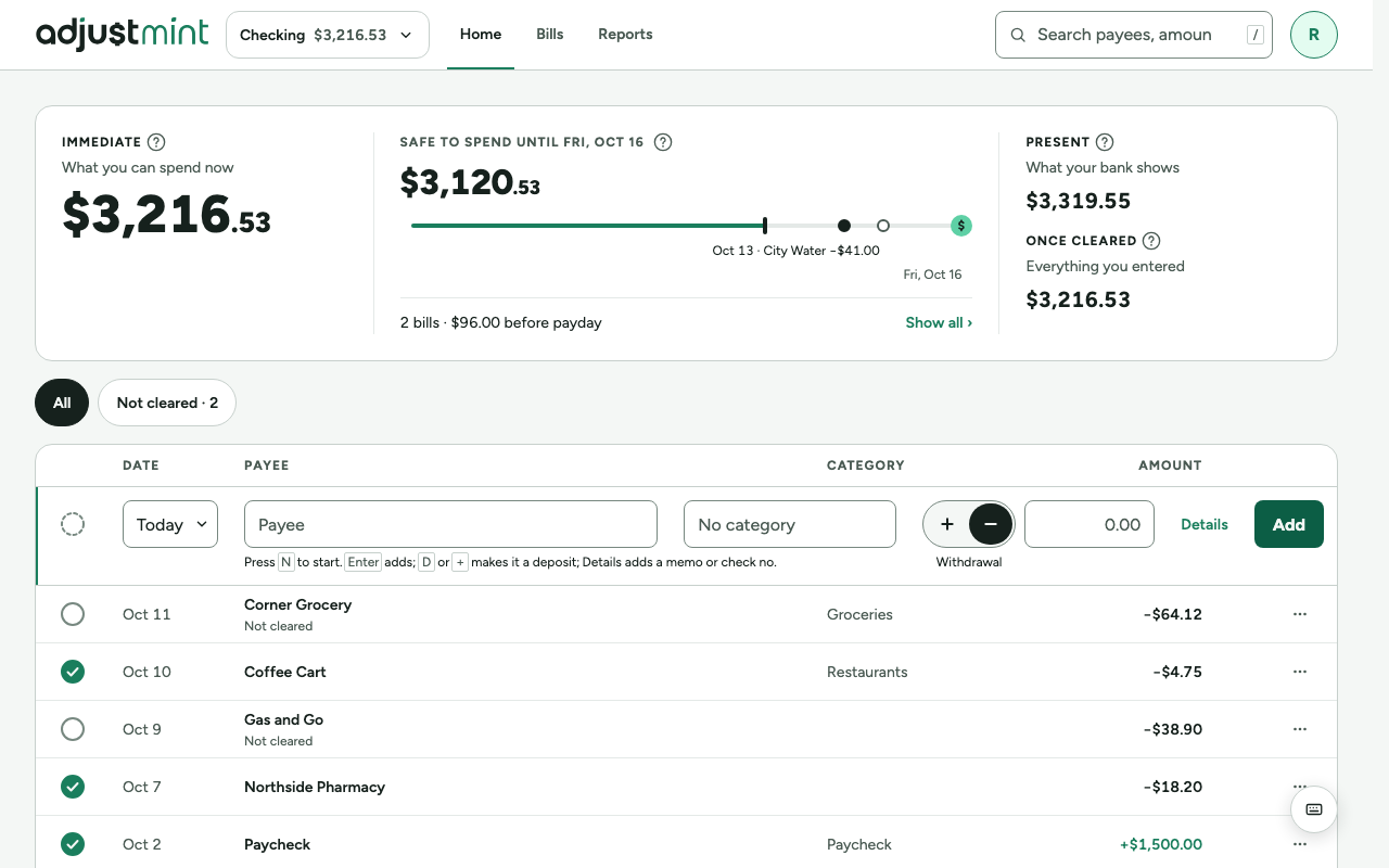
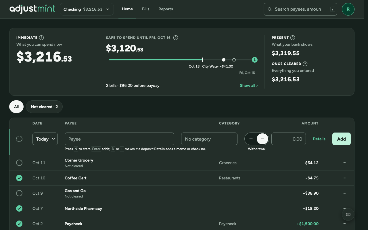
- Columns: circle 68 (44 target plus 12 each side) · date 112 · payee (fills) · category 220 · amount 150 · actions 112. The entry row keeps these columns' edges; its Type control takes width from Payee.
- Row height 52, dividers border-subtle.
- Payee and amount text-row (14/600); date and category text-row-secondary (14/400); "Not cleared" in text-secondary under the payee.
- Amounts tabular with a real minus sign; deposits text-accent with +.
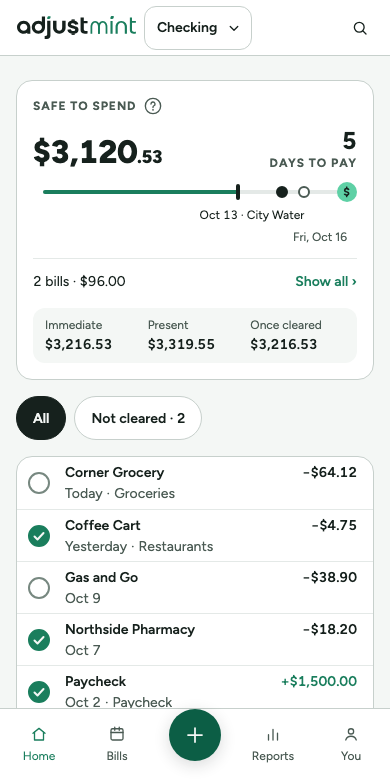
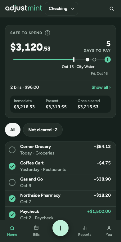
- Phones: payee and amount on line one; date and category on line two, full width, only the category truncates. "Not cleared" is screen-reader text; the empty circle shows it.
States
- Not cleared: empty circle in border-control (slate-500, 3.7:1).
- Cleared: surface-accent circle with a check in text-inverse, no status text.
- Selected (arrow keys): surface-accent-subtle tint and a 3px border-accent bar on the left.
- Hover: faint subtle tint. Focus ring on the row itself; the circle and ⋯ are out of the Tab order (Space clears, Enter opens the row, where Edit and Delete are).
Behavior
- Circle tap: clear or unclear instantly, animate the balance that moved, undo toast.
- Row tap or Enter: open details.
- Space on a selected row: clear. Arrow keys move the selection.
- The register is one Tab stop that remembers the last row. With nothing focused, ↓ or ↑ jumps to the last row used, or the first. Nothing is focused on page load.
Built 2.0.0
The app itself, version 2.0.0, with made-up data. Taken 2026-10-11.
Changes
- 2.0.0, Sep 30 2026: Current spec: clear circle first, row opens details, date and category on line two on phones, "Not cleared" as screen-reader text. Earlier history not recorded.