Page layout
Spec
The widths every page keeps, and the widths at which the layout changes. What sits on Home is in Home layout.
Widths
- Content is at most about 1280px wide (
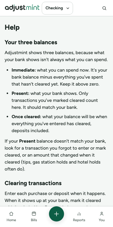
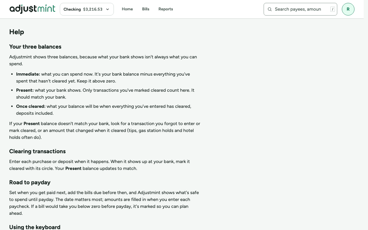
--content-max-width, 80rem), centered. - Long text, such as Help, the privacy note and the terms, is one column at most 65 characters wide (
--measure-reading), starting at the logo's left edge. - Inline hints are at most 90 characters wide (
--measure-hint). - Dialogs are at most 32rem wide (
--dialog-max-width); sign-in and other small panels 26rem. - Designed at 1440 × 900 on wide screens, and must hold at 1280 × 800. Phones are designed at 320 × 740.
Breakpoints
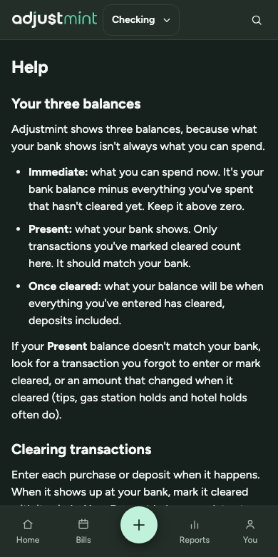
- Below 900px: the phone chrome: top bar and bottom tab bar, the register as a list, forms in dialogs that fill the screen.
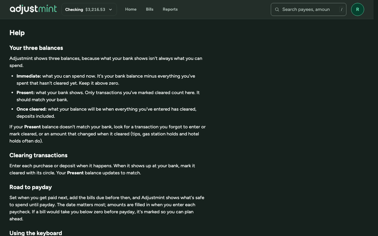
- From 900px: the app header, the balances side by side, the keyboard shortcuts button.
- From about 1024px: the register as a table with the slim entry row at the top.
- From 768px: the larger hero figure (hero-wide).
Signed-out and reading pages
- The signed-out layout has the logo and nothing else from the app frame: no account switcher, navigation, search, avatar or tab bar.
- Privacy and Alpha terms use it for everyone, signed in or not, so nothing moves going from one to the other.
Gaps and open questions
- Three breakpoints are in use (768, 900 and 1024px); #19 will settle them on 900 and 1024.
Built 1.0.0
The app itself, version 1.0.0, with made-up data. Taken 2026-10-11.
Changes
- 1.0.0, Oct 11 2026: First record of what is built: content width, reading widths and the breakpoints in use.